Case 01
Asta eStudio — Rebrand & website
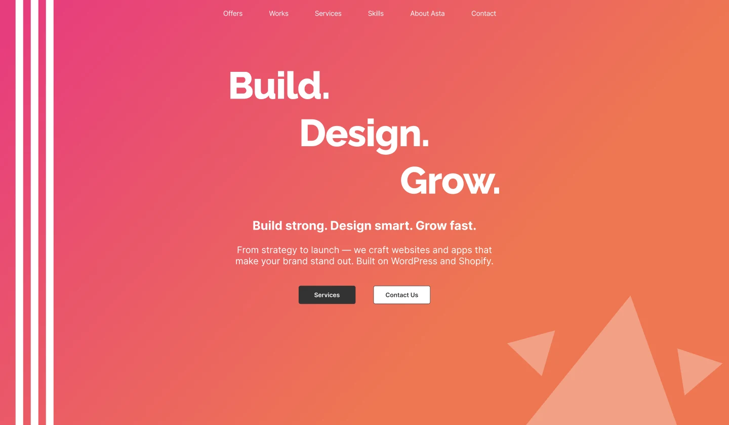
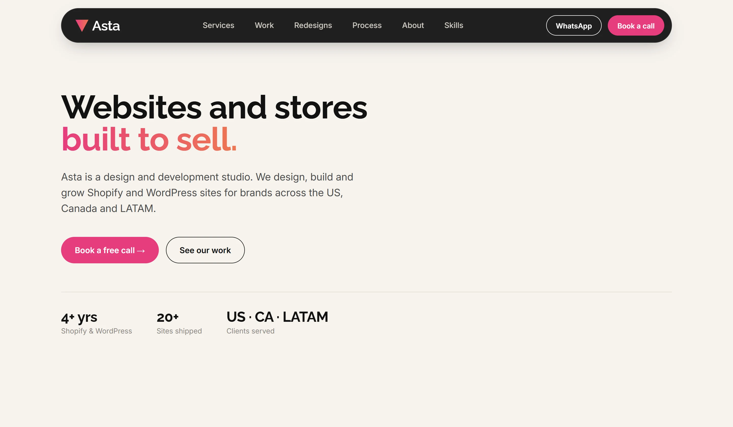
Homepage hero: old version (left) and the rebrand (right).
What changed
Four improvements that make the difference.
01
Clear value proposition
Before: a slogan with no context. After: what we do, for whom and on which platforms, in one line.
02
A brand system, not gradients
Before: pink-orange gradient everywhere. After: neutral base, two brand colors as accents and one consistent type scale.
03
Work shown as brands
Before: tech tags and tiny screenshots. After: client brands front and center, with platform and role on each card.
04
Conversion paths everywhere
Before: one "Contact Us" button. After: book-a-call, WhatsApp and a short form with the project type.
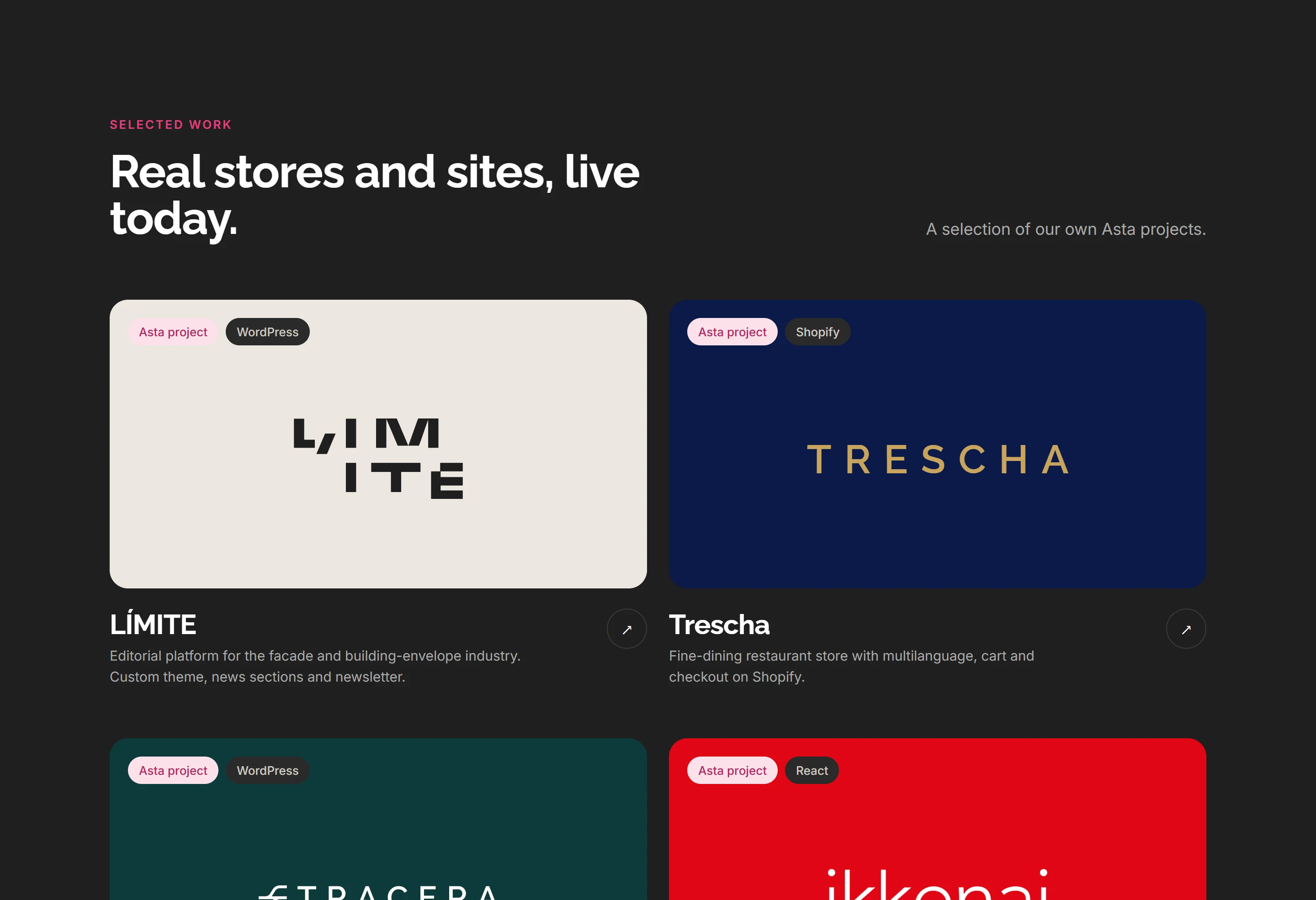
Projects section
Brands first, tech second.
A headline that sells the work
"Real stores and sites, live today" replaces a generic "Design." heading.
Each card is the client's brand
Brand color and logo instead of small screenshots, so every project reads at a glance.
Clear ownership and platform
Tags show it's an Asta project and the platform it's built on, so visitors know exactly what we did.